A certificate has a different job from an ordinary document: it’s meant to feel like an achievement. Typography carries most of that weight. The best certificate fonts balance two competing demands a sense of ceremony and prestige, and the plain legibility needed for names, dates, and credential numbers. The usual solution isn’t a single font but a deliberate pairing, where a decorative face handles display elements and a clean face handles the details.
The Two Jobs a Certificate Font Must Do
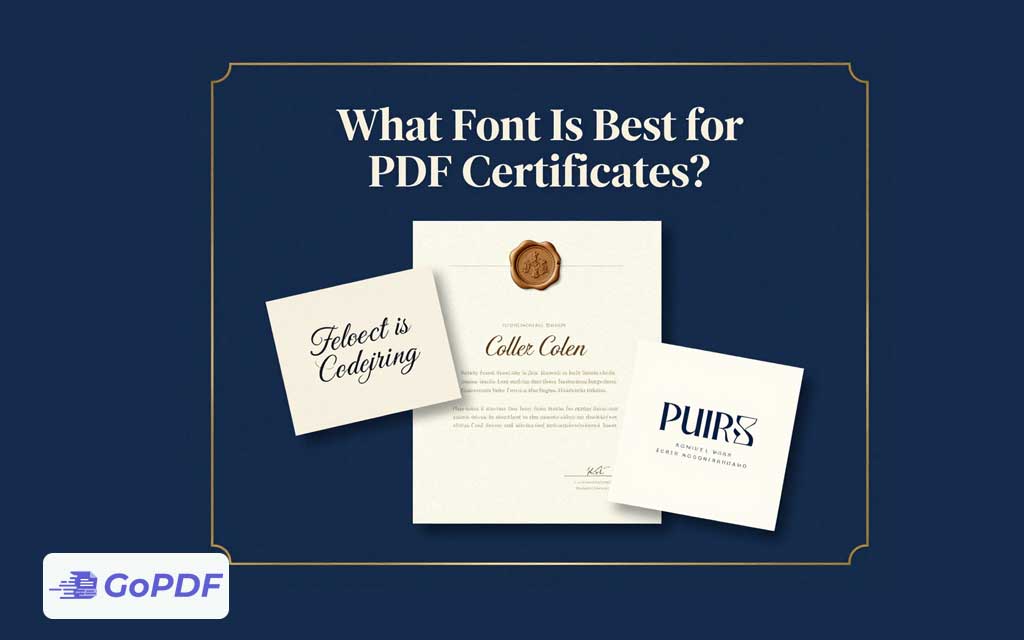
Display text the title (“Certificate of Achievement”) and the recipient’s name — can lean elegant and expressive, because it’s read once and admired. Body and data text — the issuing date, course name, signature lines, verification ID — must be unambiguous, because errors there are costly and a misread name defeats the purpose. Treating these as one styling decision is the classic mistake; treating them as two is the expert move.
Font Pairing Strategy
| Element | Recommended style | Examples |
|---|---|---|
| Certificate title | Elegant serif or refined display | Trajan-style caps, Playfair Display, Cinzel |
| Recipient name | Formal script or distinguished serif | Great Vibes, Tangerine, Garamond |
| Body / details | Clean, highly legible serif or sans | Georgia, Lato, Source Sans, Times |
| Credential ID / dates | Plain, monospaced or neutral sans | Arial, Roboto, a monospace for IDs |
A safe, attractive formula is one display face for the title, an optional script for the name, and a single neutral face for everything else — three fonts at most. More than that looks chaotic rather than ceremonial.
Legibility Limits on Script Fonts
Script and calligraphic fonts look beautiful but become unreadable in long strings or small sizes. Reserve them for the name and perhaps the title — never for dates, IDs, or body text. A flourish-heavy script can also make certain names (especially those with unusual spellings) genuinely hard to read, which is a real problem on a document meant to verify identity.
Why Embedding Is Non-Negotiable for Certificates
Certificates almost always use distinctive fonts that recipients don’t have installed. If those fonts aren’t embedded in the PDF, the recipient’s device substitutes generic ones — collapsing an elegant script name into plain Arial and ruining the design. Embedding the fonts guarantees the certificate looks identical when opened, printed, or shared anywhere. For a document whose entire value is its presentation, skipping embedding defeats the purpose.
A Practical Workflow
- Choose one display font for the title and one neutral font for details; add a script for the name only if the design calls for it.
- Set the recipient name large enough that even an ornate font stays readable — test with a long name.
- Keep dates, IDs, and signatures in the neutral font for zero ambiguity.
- Embed all fonts when exporting to PDF so the design survives on every device.
- Proof a printed copy — fine scripts and thin strokes can break up on lower-resolution printers.
Common Mistakes and Edge Cases
- All-script certificates: using a calligraphic font for body text makes details illegible. Limit script to the name.
- Too many fonts: four or more typefaces look amateurish. Three is the ceiling.
- No embedding: the most damaging error — fonts substitute and the design collapses. Always embed.
- Thin strokes on print: delicate scripts can vanish on cheap printers; choose a slightly heavier weight for printed certificates.
- Long names overflowing: a large script name can run past the layout. Build in flexible spacing or auto-sizing for variable-length names.
- Low contrast: gold or pale text on light backgrounds looks elegant on screen but prints faint. Test contrast for print.
Frequently Asked Questions
Should I use one font or several on a certificate?
Use a small pairing — a display font for the title, a neutral font for details, and optionally a script for the name. Cap it at three fonts.
Is a script font good for the whole certificate?
No. Reserve script for the recipient’s name and possibly the title. Keep dates, IDs, and body text in a legible neutral font.
Why does my certificate look wrong when others open it?
The fonts weren’t embedded, so the viewer’s device substituted generic ones. Embed all fonts in the PDF to preserve the design.
What font reads best for the recipient’s name?
A formal script for elegance or a distinguished serif for clarity — sized large enough that even long or unusual names remain readable.