An offer letter is one of the first formal documents a new hire receives, and its typography quietly signals how a company presents itself. The font won’t change the salary, but it shapes whether the letter reads as polished and trustworthy or hasty and generic. The goal for an offer letter is restraint: a highly legible typeface, conservative styling, and formatting that survives the trip from your screen to the candidate’s, their phone, and their printer.
What “Professional” Actually Means for an Offer Letter
Professional typography here is about clarity and neutrality, not personality. An offer letter contains numbers (compensation, dates, deadlines) and legal language that must be unambiguous. The right font reads cleanly at 11–12 pt, distinguishes similar characters (the numeral 1, lowercase l, and capital I), and carries no novelty associations. Fonts that draw attention to themselves undercut the document’s authority.
Serif vs. Sans-Serif
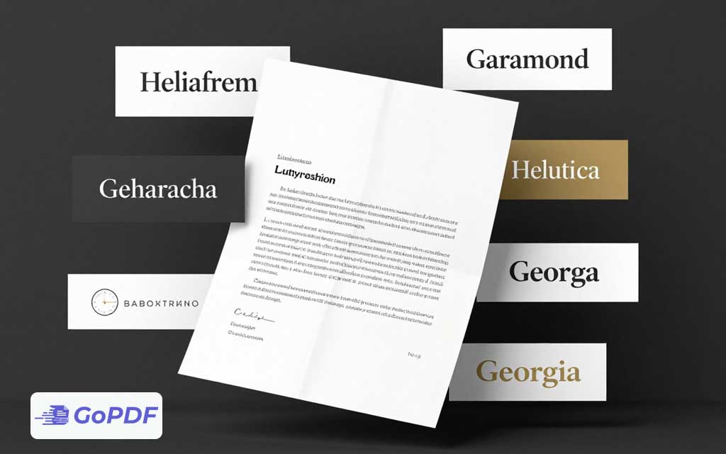
Both work; the choice sets a tone. Serif fonts (with small finishing strokes) feel traditional, formal, and established — a fit for law firms, finance, and conservative industries. Sans-serif fonts feel modern, clean, and approachable — a fit for tech, startups, and design-forward companies. Neither is more “correct”; align the choice with your brand.
Reliable Font Choices
| Font | Style | Best for |
|---|---|---|
| Georgia | Serif | Warm, readable formality; excellent on screen and print |
| Garamond | Serif | Classic, elegant tone for traditional industries |
| Times New Roman | Serif | Safe, universally available, conservative |
| Calibri | Sans-serif | Modern default; friendly and clean |
| Helvetica / Arial | Sans-serif | Neutral, corporate, highly legible |
| Lato / Source Sans | Sans-serif | Contemporary brand-forward companies |
Why Embedding Fonts Matters Here
An offer letter often uses a company brand font that the candidate doesn’t have installed. If the font isn’t embedded in the PDF, the recipient’s device substitutes a different one — reflowing lines, shifting page breaks, and sometimes splitting the signature block awkwardly. Embedding the font (or exporting to PDF with embedding enabled) locks the appearance so the letter looks identical to everyone. This single step prevents the most common “why does it look different on their end” problem.
Formatting Conventions That Reinforce Professionalism
- Body text at 11–12 pt with 1.15–1.5 line spacing for comfortable reading.
- One typeface throughout; vary weight (bold for headings) rather than mixing fonts.
- Left-aligned body text — justified text creates uneven “rivers” of white space in narrow letters.
- Consistent, generous margins so the letter doesn’t feel cramped.
- Numbers and dates in the same font as the body to avoid a patched-together look.
Common Mistakes and Edge Cases
- Mixing multiple fonts: a header in one face and body in another reads as inconsistent. Stick to one family.
- Decorative or script fonts: they undermine the document’s seriousness and reduce legibility, especially for compensation figures.
- Not embedding a brand font: the candidate sees a substituted font and broken layout. Always embed before sending.
- Tiny type to fit one page: shrinking below 10.5 pt to save a page hurts readability. Adjust margins or spacing instead.
- Light font weights: thin or light styles can disappear on low-quality prints. Use regular weight for body text.
Frequently Asked Questions
Serif or sans-serif for an offer letter?
Both are professional. Choose serif for a traditional, formal tone and sans-serif for a modern, approachable one — matched to your company’s brand.
What font size should the body be?
11–12 pt for body text. Avoid dropping below 10.5 pt just to fit a single page.
Why does my letter look different on the candidate’s computer?
The font wasn’t embedded, so their device substituted another, changing the layout. Embed fonts when exporting to PDF.
Can I use my company’s custom brand font?
Yes, as long as you embed it in the PDF. Otherwise recipients without that font will see a substitute.